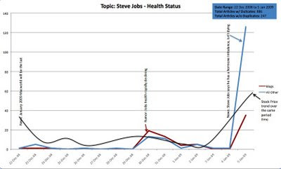
Here’s an interesting chart on the relationship between rumor, blogs, news and the stock price for Apple around Steve Job’s health . The period is Dec 22 thru Jan 5. The red line is blog volume on his ill health, the blue line is formal reported news on his health and the black curve is AAPL stock price.
Initially Apple announced that this would be the last MacWorld and that Steve would not be speaking. The stock dropped. Then Dec 30 the rumors start that Steve’s health is deteriorating. The blogs are ahead of the news and in higher volume than news, and the stock again dips. Then, when the news is official from Apple that Steve has a “hormone imbalance” (sadly no longer the whole story) the official news sites spike up, and blogs have a lower spike.
This is an example of the type of thing we see in FirstRain all the time. Blogs are ahead that something is up. They are often written by specialists with inside visibility into what’s changing – in this case people close to Apple. News follows and the stock moves on news, but that’s the same time everyone else gets the information. Most investors don’t yet have access to tools to help them sort out the junk in the blogosphere and filter for reliable sources. Queue FirstRain.
